
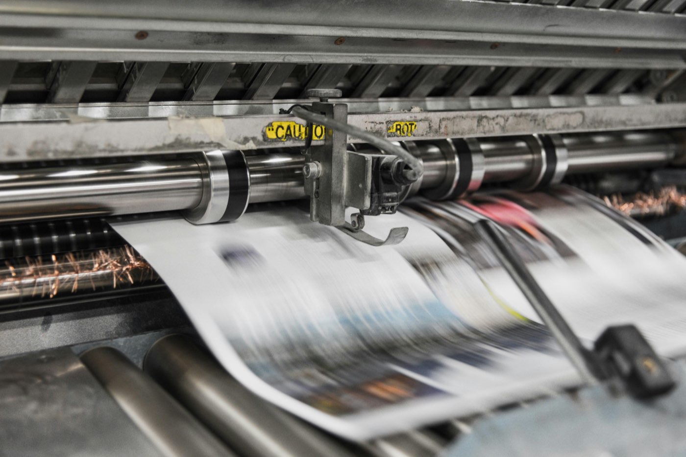
Most people wouldn't know the name, but almost all of us have read one. It sits in your newspaper looking like just another article, and that's exactly the point.
The advertorial.
What is it? Well, if you search, you'll get the boilerplate answer: a paid advertisement designed to look like a regular article or editorial piece. The name is a portmanteau of 'advertisement' and 'editorial'. But dig a little deeper and you'll find this particular format can deliver some real marketing clout, covering three bases in one hit: inform, persuade and remind.
So let's dig a little deeper, shall we? As someone who designed advertorials for magazine publishing for the best part of a decade, I know a thing or two. First things first: why not just use an advert?
It's about the story
With an advertorial, you can take customers on a journey. An advert is all about the call to action; an advertorial is all about the hook. Once you've got someone reeled in, you can express pretty much whatever your brand goal is: brand recognition, pushing a new product or marketing a new offer. The possibilities are vast and, best of all, you can wrap it up in a style that people already trust.
For example, if you're reading the Financial Times and you come across an advertorial, it may be labelled as a 'sponsored article' or 'advertisement feature', but, provided the design is strong, a reader will immediately trust it far more than a straight advert. It matches the editorial styling. As I mentioned in my piece on pause ads, commercial breaks take you out of the experience of watching a programme, and a print advert isn't so different. An advertorial does the opposite. It keeps people engaged and keeps them in the experience by acting as a sort of chameleon, usually hiding in plain sight.
A versatile format (and a recent disaster)
An advertorial is pretty versatile. I actually worked on one recently which, as it turned out, was a bit of a disaster, but I'll come back to that!
A client wanted an advertorial in a national newspaper, but with a twist. For context, it was a financial organisation, and the campaign was all about encouraging customers to take the next step, with each step up the proverbial ladder being better than the last. OK, it's not groundbreaking, but it was interesting that they wanted to go down the advertorial route.
The twist was that they wanted to combine it with step-up adverts, a fairly well-known newspaper format: a run of roughly quarter-page adverts placed across a spread, climbing from the bottom left to the top right of the facing page. Around these would sit their own 'editorial'.
I won't detail every step, but I will say one thing: on a project like this, bring in specialists. The turnaround was tight. The client had provided their draft copy and mock-up adverts in preparation. We called in a professional sub-editor and a designer, and managed to knock it out of the park in a day or two.
That doesn't sound like much, but with financial organisations, things get approved by committee, especially with so many regulations and compliance rules in place. It's a wonder anything gets done in a bank! Add to that the internal wrangling to balance the aesthetics, so it didn't look too much like a news article but could still stand on its own while keeping some brand equity.
It looked great, everyone was happy, the client signed it off, and that was that.
Or was it?
When it all goes wrong
With the good, you also get the bad. On the day of publication, the dreaded email came through, with pictures attached (a warning sign if ever there was one). Yes, the text on the step adverts was unreadable. Compensation was mentioned, and rightly so.
So, as a bonus, here's what to do when it all goes wrong. First tip: don't panic. Establish the extent of the problem and go from there. In our case, it was national: every copy, everywhere, had the same issue.
This is the stage where everyone gets involved, from the C-suite down, and so the investigation begins. This one turned out to be pretty straightforward: human error. The mock-up adverts had been used in the final version. They were mostly print-ready, but they used an unusual kind of font: variable fonts. These are a fairly recent addition to the designer's toolbox (they arrived in 2016) and, unfortunately, they don't always play nicely with older commercial print RIPs, the software that turns files into printing plates.
The creative agency had supplied print-ready files with the fonts converted to outlines, but these had exactly the same filename as the mock-up files, and the mix-up slipped past quality control. The fix? Re-run the advert, correctly this time, at no charge. A lesson learned: check your filenames, and preflight everything.
Not just for print
Advertorials aren't just for traditional media, though. They have their place in the digital world too, where they've evolved into native advertising and are now finding their way into AI assistants, and I've found an increasing number of clients wanting to use the format. There are stats to back up the claim that they build credibility, have a longer-term impact and increase engagement. One well-known eye-tracking study found people looked at native ads 53% more often than standard display ads. What's not to like?
They do have their detractors. Advertorials can be seen as misleading or deceptive, because online they often look just like blog posts while actually being paid advertisements. For consumers, that blurs the lines and can lead to confusion and mistrust.
Critics argue that advertorials should be clearly labelled as advertisements, both to avoid misleading consumers and to protect the credibility and integrity of the publications that run them. In the UK, the advertising regulators have just updated their guidance on exactly this, and I read only recently how a high-profile public figure could fall foul of it. Influencers especially are under the spotlight, as big sums of money can be involved, and a paid promotion can be passed off as something more like a personal recommendation.
I can't speak to the legal side, or whether the new rules will tackle that sort of problem. But what I can say is that I have a soft spot for the humble advertorial. Most consumers wouldn't even recognise the name, yet almost all of them will have come across one at some point in their lives.
Sources and further reading
On AdDeck:
- Advertorial: how print advertorials work.
- Native ads: the advertorial's digital descendant.
Elsewhere:
- IPG Media Lab and Sharethrough: Exploring the effectiveness of native ads (2013 eye-tracking study).
- Lewis Silkin: New influencer guidance from the ASA, CAP and CMA (October 2026).